Aligning stakeholders with Research Findings.
Mar 15, 2022

Summary:
At DataRobot, I tackled the challenge of keeping stakeholders aligned with research findings. Although we had extensive research data, it was often disconnected from our primary design workspace, Figma, and was quickly forgotten after presentations.
To bridge this gap, I introduced emoji-based highlight bubbles in our Figma mockups. These bubbles provided quick-access insights, including user quotes, data points, and UX heuristics, directly on the design screens. This approach made presentations more engaging, encouraged deeper discussions, and kept research insights front and center for stakeholders and developers alike.
A few do’s I found helpful: include highlights for validated designs or user-driven fixes. Avoid overloading early explorations with highlights—they can become distracting. This method turned design sign-offs into more collaborative sessions and helped reinforce user-centered decisions throughout the project.
Background
I work at DataRobot, where we conduct extensive user research and data analysis to inform our designs. All findings from user research, customer surveys, user session recordings, usability tests, and data analysis are well-organized, labeled, and sorted.
There is one small detail there…
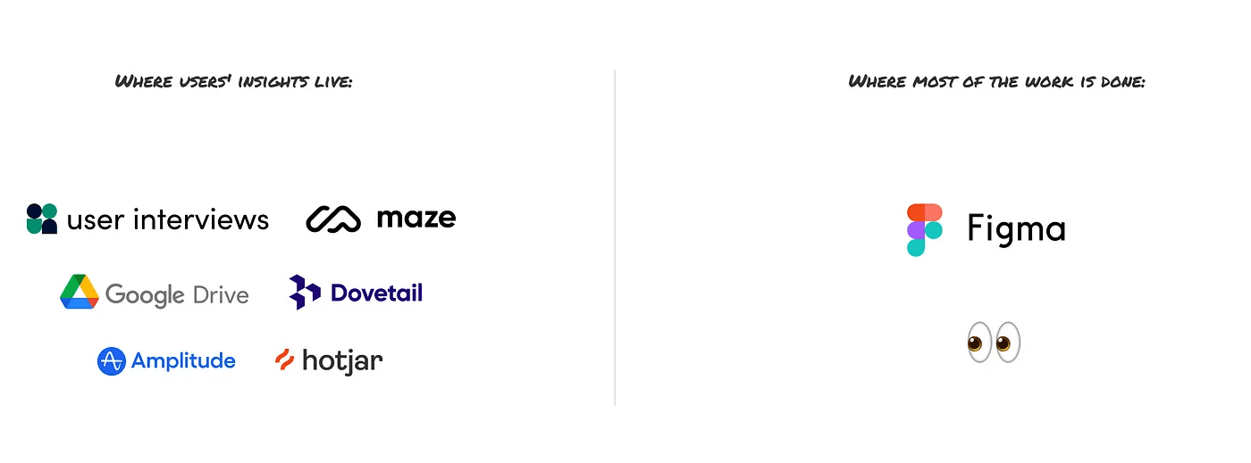
All research findings, articles, data insights, and benchmark reports are disconnected from the main workspace, which in our case is Figma. They are too extensive to add to the mockups.
Even if we have all the user findings, it can be difficult to keep colleagues aligned with those insights. Let’s face it: as soon as your presentation ends, everyone forgets about the insights the next day.
Out of the loopI wanted to help stakeholders be better aligned with research findings and have them in a space where we all collaborate. As a fan of the folks at growth.design, I borrowed the idea of supplementing my mockups and prototypes with highlights from user research in a similar way.
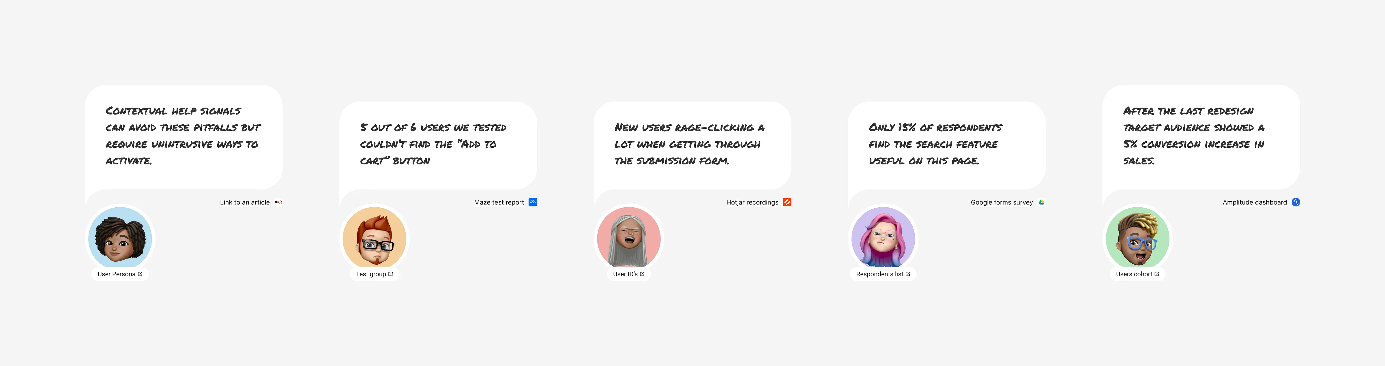
I created a set of emoji bubbles that can be quickly added to any mockup screen and used to provide additional context to designs during presentations. Each bubble presented user quotes from research, data insights from the analytics team, or simple vocalization of UX heuristics.
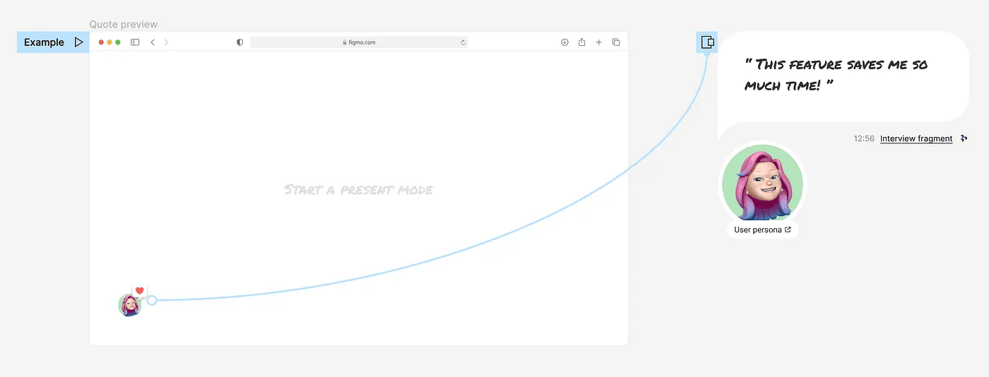
A combo of a small on-screen indicator and user quotes that pop on a click
After trying this approach in various meetings and team syncs here are a few things that I noticed:
Presentations were more engaging for stakeholders and less confrontational for highlighting design decisions.
After the presentations, there were more questions than usual, leading to deeper and more productive conversations.
The highlights are located next to screens in a Figma file and are frequently observed by all colleagues involved in the project.
Developers have started to gain insights from research and become more involved in user experience.
Company product meeting to discuss the new onboarding flow design tested with users.
Some do’s and don’ts:
Every company has a unique structure and decision-making process, so there is no guarantee that this approach will work for your specific case. However, one thing I can guarantee is that it will make your design sign-offs less dull.
Here are a few do’s and don’ts to keep in mind if you decide to give it a try:
Do’s:
When the design is exploration phase and no major design decisions where made.
Highlight some UX best practices that were used for main design decisions
Highlight important parts of the design that were validated through research or testing to celebrate a team’s success.
Highlight features of the design that might benefit from upgrade/change functionality based on user feedback
Highlight parts of the design that were fixed based on the user feedback or test results. (To not come back to it later)
Screens with quick design fixes/changes that are trivial or self-explanatory.
Don’ts:
Add highlights in the early stages of design exploration. It may add an extra layer of work, especially when lots of pieces start moving around frequently.
Highlight too many minor design decisions. Including too many minor details in a presentation can be overwhelming and may not lead to productive discussions later. Instead, focus on the most important aspects.
Freebie:
Conclusion:
This article is part of my journey to thoroughly explore the alignment problem between research findings, design, and business. If you have any interesting examples or cases that helped you align stakeholders and the development team with research findings, please share them or send me a direct message. Thank you!