Re-styling mobile app with AI-generated heat maps
Feb 28, 2022
Summary:
I helped design a roulette app for a new company aiming to stand out among established competitors. My role was to create and present a concept, handle all deliverables, and prepare assets for developers. In just two weeks, I used AI-driven heatmaps to optimize the app’s UI, focusing on reducing visual clutter and improving CTA accessibility. Key changes included moving primary buttons within easy reach, highlighting exciting game moments, and refining the visual hierarchy for better player focus. The result? A visually appealing, user-friendly design with enhanced engagement and conversion.
Background:
A friend of mine asked for my help in designing a mobile roulette app for a newly established company. They wanted to create an MVP with the same basic feature set as well-known competitors, but with something that would set them apart from the competition.
Challenge:
🔥 Stand out from the competition with a new product that offers the same features as competitors.
My role:
Create and present the project concept to stakeholders.
Prepare all deliverables and hand off all assets to developers.
Solution
In two weeks, I use Visual Eyes as the main tool to find areas for improvement and test my designs against competitors' products. Rethink the visual hierarchy of UI elements to better meet the needs of players. As a result, new designs show improved aesthetics and better conversion rates.
🏆 - Visual clutter was reduced from 32% to 49% without changing the content.
Increase the visibility of the call-to-action (CTA).
The primary call-to-action buttons have been moved closer to the bottom of the screen to ensure that people can reach it easily with one hand while holding their phone.
Emphasize visually on the more exciting moments of the game flow.
Process:
[x] Conduct competitor analysis
[x] Using AI heatmaps to identify UI issues.
[x] Performing Usability Analysis.
[x] Designing information architecture.
[x] Explore different visual styles for UI.
[x] Create high-fidelity prototypes.
[x] Test new designs against competitors using heat maps.
[x] Prepare the Design System and Style Guides, making them ready for handoff.
Conduct competitor analysis
What are the weak spots among competition we can capitalize on in our product?
The client has provided a few products they wish to compete with. Since the sets of features and user flow will be the same, we can stand out by focusing on a few key aspects.
All competitors have almost identical user flows, so it is recommended to keep the same flow. I mapped out the features and main user flow to create a scope of work.
Using AI heatmaps to identify UI issues.
I perform a visual importance test for each screen to analyze the main interactive elements and calls to action (CTAs).
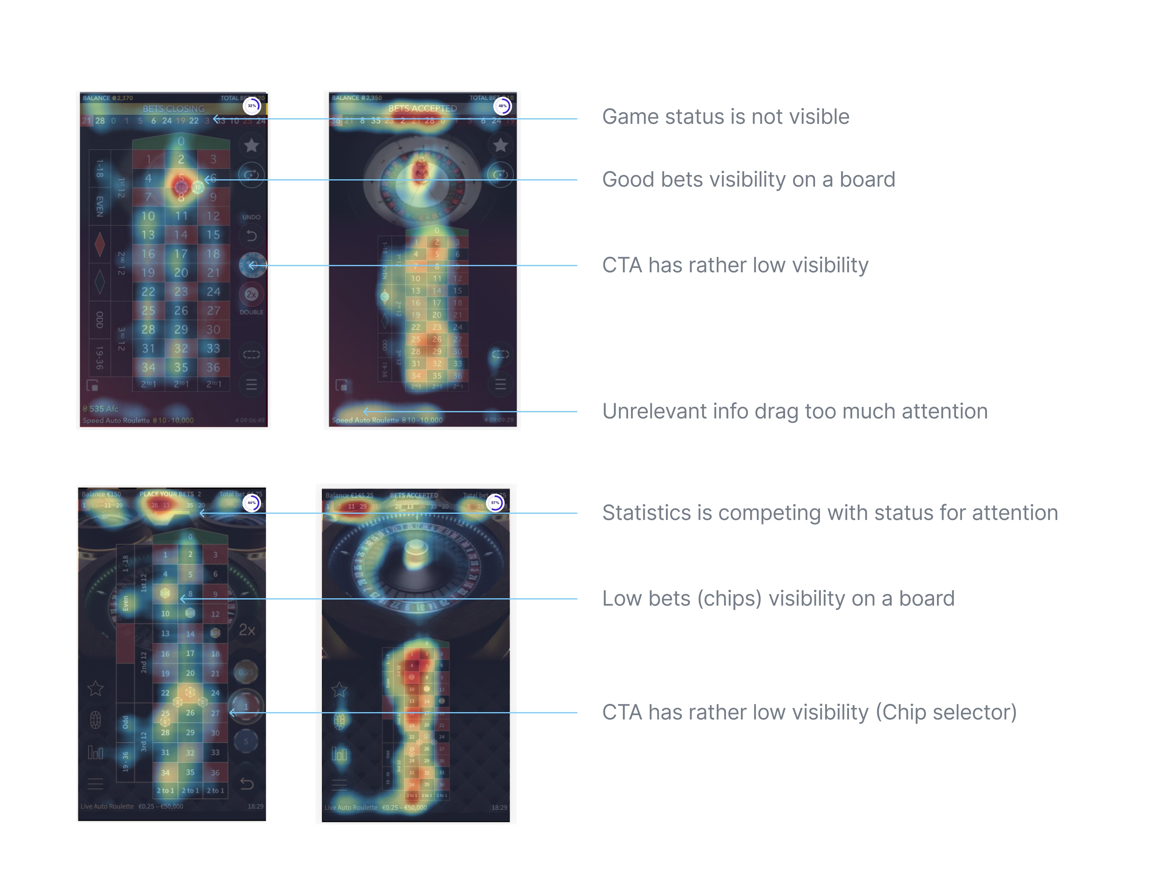
Reading AI heat maps:
💡 "Foggy" areas indicate that attention is spread out, which makes it harder for people to focus on something specific.
💡 "Islands" of blobs are a good indicator that each UI element is easy to find on the screen at a glance.
Performing Usability Analysis.
The user interface (UI) is dynamic and changes quickly during the user flow. I conducted an accessibility analysis to ensure that all interactive elements meet standards and can be accessed quickly.
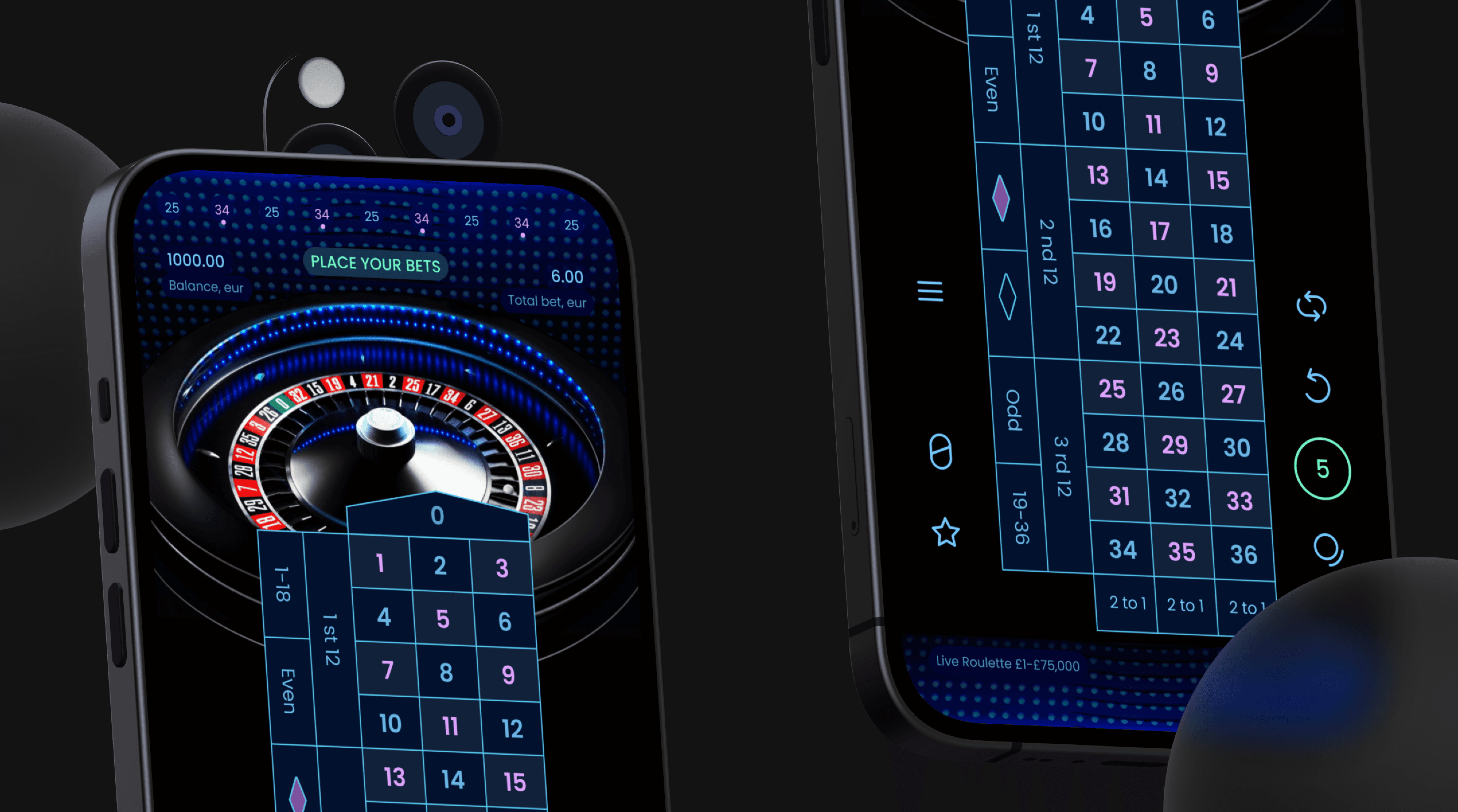
The main interactive elements are the roulette table and chip selector. Players have a limited amount of time to select a number and place a bet and it is important to consider the reachability of elements using thumbs and margins of tap errors.
🔑 The competitor's product was effective in meeting the button size requirements, but it was not as well-suited from an ergonomic standpoint.
Findings and Focus Areas:
In this game, players interact with 36 numbers, with zero being the most frequently used. The numbers should be large enough to be easily tapped on. Most of the game's competitors have implemented this feature successfully. Additionally, the size of each table cell meets the accessibility standards for both iOS and Android.
The chip selector is located on the right side of the screen, in the middle or bottom section, within the green zone for an average thumb's reach. The betting chip is the main call-to-action and should be easily accessible with one hand. Chips' values should be clearly visible even in small sizes when placed on a field.
Lack of excitement: when a player has a winning number, it is one of the most thrilling moments in the game. Therefore, we should emphasize announcing a winning number as an exciting event for the player in our design.
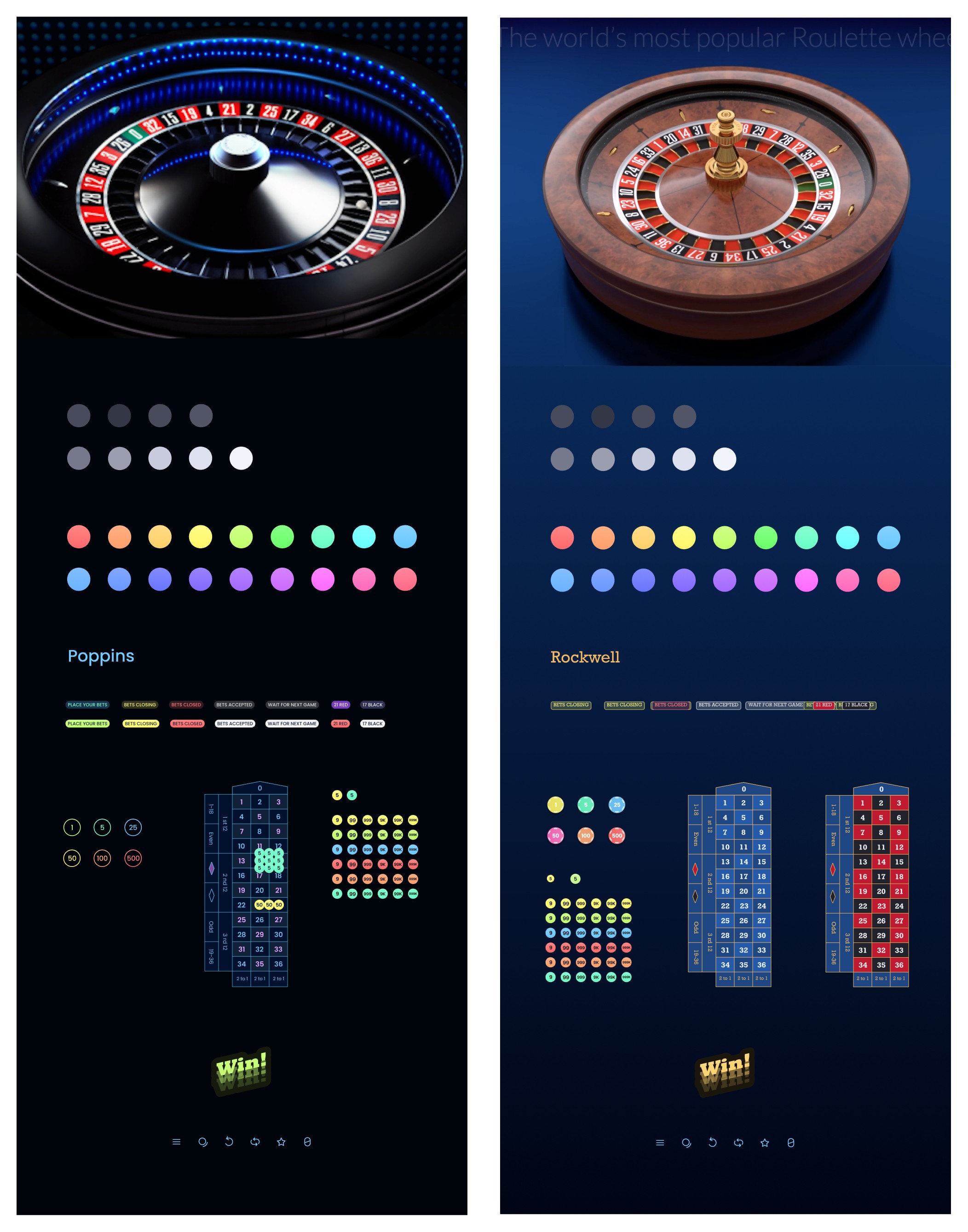
Explore different visual styles for UI.
Suppliers provide standard designs for the roulette wheel. As the wheel is a central element of the app, its style should be taken into account.

Requirements:
Fit wheel style
Emphasize exciting moments in the game
I researched table and chip designs to create an immersive experience in the app that players would love. I found some modern examples that can be combined with the existing wheel designs from the manufacturer.
Designing information architecture
I am experimenting with a grid to fit all the small elements that we need to display.
Additionally, I am experimenting with the size of the table and ensuring that the CTA layout is easily accessible and meets accessibility standards.
I am also experimenting with the positioning of chips to ensure that the betting options can be reached with a high thumb when users are holding the phone with one hand.
Test new designs against competitors using heat maps.

Rethink the visual hierarchy of UI elements to better meet the player's needs. Visual clutter was reduced from 32% to 49% while retaining the same content.
Increase the prominence of CTAs.
Prepare the Design System and Style Guides for handoff.
Finalizing with style guides and design systems to hand off our work to developers.
Conclusion:
The project was completed within a few weeks and yielded pleasing results. It was interesting to work on a project with tight restrictions. Tools like VisualEyes might provide great value, especially if you:
Are limited on time and cannot perform a moderated usability test
Are building a new product and do not have access to historical data, such as Hotjar or Google Analytics