Redesigning a Chrome extension to reduce churn.
Feb 6, 2022
Summary:
I led the redesign of Productdesign.tips, a Chrome extension that combines Dribbble shots and design articles in each new tab. Initially, I built it solo, but as it grew to 10,000 weekly users, I brought on two friends for development while I focused on design and product improvements.
After seeing a 40% first-day churn rate, I launched a simple user survey to understand why people were uninstalling. I identified key issues: users already had a preferred new tab, content wasn’t always visible, and the layout felt visually overwhelming. We addressed these by offering a Slack channel as an alternative, highlighting more content, and adding a darker, more eye-friendly theme.
The results? We cut churn to 30%, doubled daily users, and boosted the Chrome store rating to 5 stars. If I could do it over, I’d add more A/B testing and conduct interviews for deeper insights.
Background
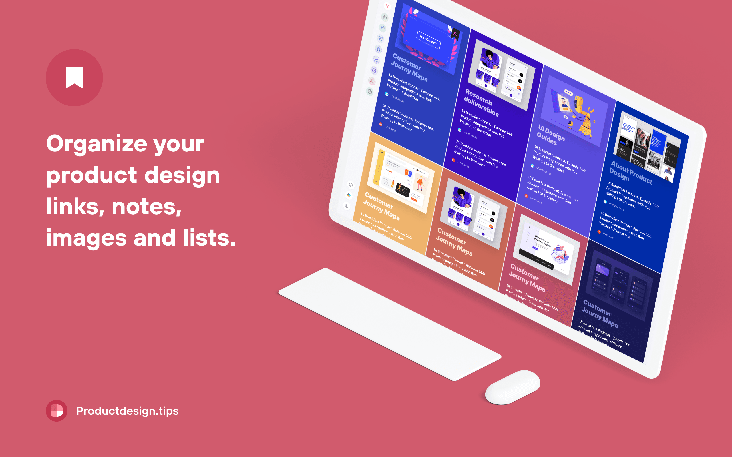
I started Productdesign.tips as a pet project with a simple idea:
💡 Combine inspirational Dribbble shots with a library of product design articles to replace blank the new tab in your browser.
Challange
The product's first version won the 🏆 product of the day #2 medal on Producthunt.com. Since then, it has grown into a community of 10,000 designers who use the extension on a weekly basis. I have been collecting metrics to further improve the product and discovered that
🔥 40% of new users churn on the first day after installation.
My role
I worked as a designer and developer for the first version. Later, I asked my two friends to help with coding while I focused on improving the product.
👤 I was responsible for designing the product and managing a team of two developers to ship the redesign.
Solution
Based on user feedback, I identified pain points with a product, developed design improvements, and led a team to implement them in a new version of the product. This resulted in:
🏆 **** The churn rate within the first 24 hours of installation was reduced from 40% to 30%. **** The number of daily users grew by a factor of 2. **** The Chrome web store rating improved to a perfect 5-star rating. **** The number of re-installs after churn increased by 15%.
Process
[x] Step 1: Survey users who churn to collect raw feedback.
[x] Step 2: Cluster the feedback to find pain points.
[x] Step 3: Explore pain points, form hypotheses, and ideate solutions.
[x] Step 4: Implement solutions and measure outcomes.
Step 1. Survey users who churn
I started with a simple, open-ended survey consisting of a single question. Whenever somebody uninstalled the extension, they were redirected to a form with a single question: "Oh no, why did you uninstall?".
Step 2. Cluster the feedback to find pain points
I grouped related answers to similar issues into a few categories and updated the survey with pre-filled answers to determine which problems we should focus on first. After the second round, we received approximately 500 responses. Here is the distribution we obtained:
Step 3. Explore pain points, form hypotheses, and ideate solutions.
Feedback:
36.7% - “🙈 I have something else on my New Tab. Bring it back!”

Exploration
After some desk research, I've come to realize that our competition isn't just with similar extensions like Muz.li, but rather with any extension that replaces a user's default new tab in their browser. Some users may have productivity or other extensions that our extension replaces.
Hypothesis
It will be hard to convince people to change their productivity custom new tab to something else. However, if we can redirect users to another channel, we can keep them and reduce their frustration.
Solution
Offer to subscribe to a Slack channel that provides a daily summary of updates.
Result
Thanks to an update we didn’t lose users who had something important for them in the new tab and grew the Slack channel audience from 0 to 2,000 subscribers in the first months.
Feedback:
11.2% - “😞 I see no content in the New tab / No updates.”

Exploration
After investigating a problem, it became clear that extensions sometimes crash due to issues on Chrome's side that we have no control over.
Hypothesis
Informing users about the issue can help them fix it.
Solution
I updated the uninstall survey to include a follow-up section each time a user selects "😞 I see no content in the New tab / No updates." as their reason for uninstalling.
Result
The number of re-installs after churn has increased by 15%.
Feedback:
8.9% - “😒 Meh. Don’t cover topics I’m interested in.”

It wasn’t obvious that we have lots of topics hidden under the menu button, on a screen after the first installation people can see only a few with the newest content
Hypothesis
If we can create more prominent side bar with topic icons it might drag more attention to whole extension content
Result
Percent of people who churned because of content reduced by 25%
7% - “😵 My eyes, no. Too strong visually it's hard to read.”

Exploration
For some users, the layout design was hard on their eyes. Although we used a lot of colors in the app, which looked good, the visual impact of a "color blast" multiplied dozens of times a day can be irritating.
Hypothesis
Providing a less colorful layout option with a dark mode shift during nighttime might make content reading more pleasing for the eyes.
Result
The percentage of people who churned because of the poor layout was reduced by 63%.
What would I do differently if I had to do it again?
Productdesign.tips was an amazing project that taught me how to run a small product. Cheap testing can yield amazing results. If I were to do it all over again, I would definitely add more A/B testing to the mix and conduct some 1-on-1 interviews. Sometimes, I felt like I lacked context on certain feedback, and having additional insights would be helpful.